This baseball cap logo placement wholesale guide covers artwork specifications, positioning standards, and the approval workflow that prevents costly production errors. Use it as your pre-production checklist before submitting artwork to any manufacturer.
You emailed your logo file to the factory, approved the digital mockup, and waited four weeks for delivery. When the box arrived, every cap had the logo slightly off-center — some tilted left, some too high, and three dozen were too close to the brim seam to embroider cleanly. The factory said, “That’s within tolerance.” Your retail buyer rejected the entire batch. For wholesale buyers, logo placement errors are the #1 reason for bulk order rejection — and they are almost entirely preventable with a proper artwork approval process.
Logo placement is the single most scrutinized visual element on any custom baseball cap. A misaligned logo doesn’t just look unprofessional — it devalues your entire brand and makes your product unsellable at retail. Yet according to a 2024 survey by the Promotional Products Association International (PPAI), 23% of decorated apparel orders require at least one round of rework due to artwork-related issues, with ASTM D7330 providing standardized tolerance guidelines for decorated apparel, with placement errors ranking as the second most common problem after color matching. This guide breaks down everything you need to specify, verify, and approve before your next baseball cap order goes into production.
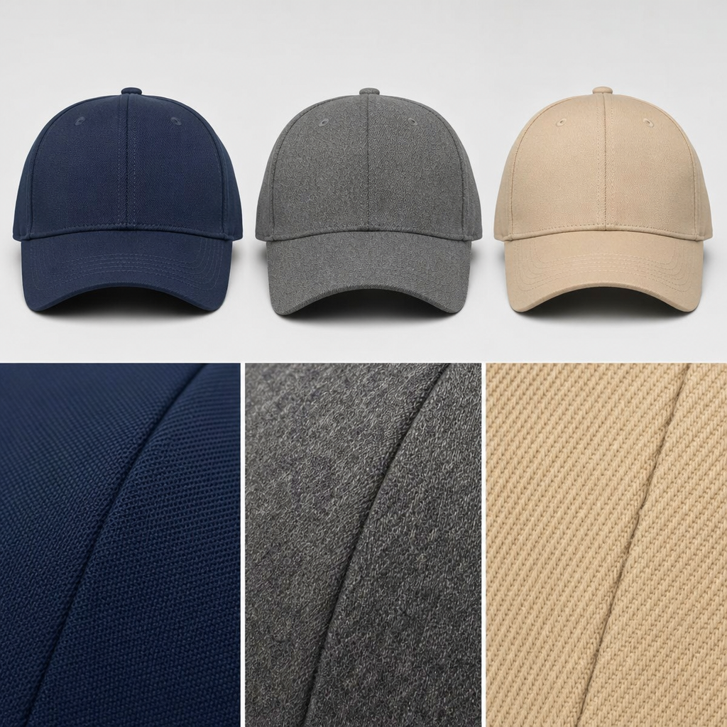
At Hongyuecap, our Guangdong factory processes over 8,000 custom logo caps per month for brands across North America, Europe, and Australia. The most consistent predictor of a smooth production run isn’t the decoration method or the cap style — it’s the quality of the artwork approval file. Before diving into the specifications, take a look at our complete baseball cap collection to understand how different cap silhouettes affect logo placement options.
1. Why Logo Placement Errors Happen — and the Three Documents That Prevent Them
Logo placement errors happen because buyers and factories operate from different reference points — and most of the time, neither side realizes the gap until the bulk order arrives. The buyer thinks in terms of the finished cap on a customer’s head: the logo should sit centered on the front panel, visible from eye level. The factory thinks in terms of the sewing machine jig: the embroidery hoop or print platen needs a fixed registration point measured from the nearest seam. When these two reference frames don’t align, you get “off-center” logos that technically match the factory’s measurements but look wrong in the mirror.
The three documents that prevent this disconnect are: (1) A detailed Artwork Specification Sheet — this is not the same as your logo file. It includes precise measurements (in millimeters, not inches — metric is the global manufacturing standard for apparel), placement references (center of front panel, distance from crown seam, distance from brim), and tolerance ranges (±1.5mm for embroidery, ±2mm for screen printing); (2) A Digital Mockup with Measurement Overlays — this shows your logo placed on a flat-lay photo of the actual cap style you’re ordering, with dimension callouts and placement arrows; and (3) A Pre-Production Sample (PPS) Photo Approval — before bulk production starts, the factory should send you a photo of one actual decorated cap (not a digital rendering) with a ruler placed next to the logo for scale verification. Skipping any one of these three documents is the root cause of most logo placement disputes.
Hongyuecap includes all three documents as standard with every custom logo order — artwork spec sheet, measurement-overlay mockup, and PPS photo approval — because we’ve found that this three-document system reduces placement-related rework by over 90% compared to email-only artwork approval. For more on our factory’s quality control process, visit our Why Us page to see how we handle every step from artwork to delivery.
2. Standard Logo Placement Positions by Cap Panel and Decoration Method
Standard logo placement on baseball caps follows proven positions that match both manufacturing capabilities and visual balance, with the exact coordinates shifting slightly depending on whether you’re using embroidery, screen printing, DTF transfers, or woven patches.
Front Panel Center (Position A). This is the classic placement — centered horizontally on the front crown panel, positioned vertically between the crown seam (top) and the brim attachment (bottom). For a standard 6-panel structured baseball cap with a crown height of approximately 110-115mm, the logo’s vertical center point typically sits 45-55mm above the brim seam. Embroidery logos work best at 50-65mm wide × 20-30mm tall for this position. Screen-printed logos can be slightly larger — up to 70mm wide — because there’s no stitch density to manage. The critical measurement here is the baseline offset: the distance from the bottom edge of your logo to the brim seam. If this varies by more than ±2mm across a batch, the logo will appear to “float” at different heights — a defect that customers notice immediately when comparing two caps side by side.
Side Panel (Position B). Side placement is increasingly popular for streetwear and lifestyle brands, typically positioned on the wearer’s left side panel (the cap’s right panel when viewed from the front). The standard position is centered horizontally on the side panel, 25-35mm from the crown seam on top and 20-30mm from the brim seam on bottom. Side logos are usually smaller — 30-40mm wide for embroidery, up to 50mm for printing. The main challenge with side placement is that curved panels distort logos differently than flat panels, so always request a PPS photo from a side angle, not just a flat lay.
Back Arch (Position C). For fitted and snapback caps, the back arch above the closure is prime real estate for a secondary logo or brand mark. The standard position is centered horizontally on the back arch panel, approximately 15-25mm above the closure seam. This position is typically smaller — 25-35mm wide — and works best with embroidery due to the curved, narrow surface area.
Brim / Visor Underside (Position D). Undervisor printing has surged in popularity since 2023, particularly for limited-edition drops and streetwear collaborations. The print area is approximately 70-90mm wide × 20-25mm tall, centered on the underside of the brim. This position requires specialized printing equipment (flatbed UV or pad printing) and is not available at all factories. If your brand identity relies on undervisor detailing, confirm this capability during supplier vetting — not after placing your order.
3. Artwork File Requirements That Every Wholesale Buyer Should Know
Artwork file requirements for baseball cap logo placement vary by decoration method, and submitting the wrong file format is the #1 cause of production delays in custom cap manufacturing.
Vector Files (Required for Embroidery). Embroidery machines read stitch paths, not pixels. This means your logo must be provided as a vector file — .AI, .EPS, .SVG, or .PDF with editable vectors. A JPEG or PNG screenshot of your logo will be rejected because the factory needs to digitize the artwork, converting shapes into stitch coordinates. The digitizing process (which Hongyuecap performs in-house) costs $25-50 for a standard logo depending on stitch count and complexity. A 5,000-stitch logo takes approximately 30-45 minutes to digitize; a 15,000-stitch design can take 2-3 hours. Key specifications to include: desired stitch density (standard is 0.4mm between stitches), underlay type (edge-walk or center-walk), and pull compensation (fabric stretches during embroidery, so lettering needs to be 2-3% oversized to account for this).
Raster Files (for Screen Printing and DTF). Screen printing and DTF (Direct-to-Film) transfers use raster files — PNG, TIFF, or PSD at 300 DPI minimum at actual print size. The most common mistake buyers make is submitting a 72 DPI web-resolution logo and expecting it to look sharp when printed at 60mm wide. At 72 DPI, a 60mm logo contains only about 170 pixels of detail, which produces visibly jagged edges. At 300 DPI, the same 60mm logo contains approximately 710 pixels — clean, crisp, and production-ready. Always include a 3mm bleed around the artwork edges for screen printing.
Pantone Color References. Color is the #1 artwork-related dispute in custom cap production. A logo that looks navy blue on your calibrated monitor may print as royal blue on fabric if you didn’t specify a Pantone code. For embroidery, specify Pantone Solid Coated or Thread Color numbers (e.g., Madeira 1782 or Brother 034). For screen printing, specify Pantone Solid Uncoated. Always request a thread color card or ink drawdown for approval before production — digital color representations on screens are approximations at best. For more on decoration method comparisons, see our custom baseball caps wholesale guide.
4. The Pre-Production Approval Workflow: From Artwork Submission to Green Light
The pre-production approval workflow for baseball cap logo placement follows a five-step sequence that typically takes 7-12 business days from artwork submission to final production approval when executed correctly.
Step 1: Artwork Review (1-2 business days). After you submit your logo files, the factory’s pre-press team checks file format, resolution, color information, and placement specifications. If anything is missing — no Pantone codes, wrong file format, missing placement measurements — they should flag it immediately rather than guessing. Hongyuecap’s pre-press team reviews every submission within 24 hours and sends a checklist confirmation or a request for missing information so nothing slips through.
Step 2: Digital Mockup Creation (1-2 business days). The factory creates a digital rendering of your logo placed on the actual cap style, complete with measurement callouts showing the exact position. This mockup should be to scale and show the logo from at least two angles (front and ¾ view). Approve this mockup in writing — email is fine, but be specific: “Logo placement and size on mockup #2026-0501-A is approved for production sampling.”
Step 3: Pre-Production Sample (3-5 business days). One actual cap is decorated with your logo using the approved mockup specifications. This is the moment of truth. The factory photographs the PPS with a ruler next to the logo and sends you the photos. Measure the logo position in the photo. If the spec says 50mm from brim seam and the photo shows 48mm, that’s a 2mm variance — within the ±2mm tolerance for most decoration methods. If it shows 55mm, that’s +10% and should be flagged.
Step 4: PPS Approval or Revision (1-2 business days). Review the PPS photos carefully. Check: horizontal centering (measure from the logo’s left edge to the left seam, and right edge to the right seam — these should be equal within ±2mm); vertical position (as specified in your artwork sheet); color accuracy (compare against your Pantone reference under natural daylight); and decoration quality (no loose threads on embroidery, no ink bleeding on screen prints, no peeling edges on DTF transfers). If anything needs revision, be specific: “Move logo down 2mm; current position is 55mm from brim, target is 53mm.” A second PPS round adds 3-5 days but is far cheaper than reworking a full production run of 500 pieces (which costs $800-1,200 in wasted materials and labor).
Step 5: Bulk Production Green Light (immediate). Once you approve the PPS, bulk production begins. The approved PPS becomes the reference standard against which every cap in the production run is checked. Most factories use an AQL 2.5 inspection standard, meaning in a batch of 500 caps, up to 14 units can have minor placement deviations and still pass. For premium brands, specify AQL 1.5 (up to 10 deviations per 500) or AQL 1.0 (up to 7 deviations). Hongyuecap offers AQL 1.5 as standard for all custom logo orders at no additional charge.
5. Common Logo Placement Defects and How to Spot Them in Quality Inspection
Common logo placement defects fall into five predictable categories that a systematic quality inspection can catch before they reach your customer, and knowing what to look for is as important as specifying correct placement in the first place.
1. Horizontal Misalignment (Frequency: ~35% of placement defects). The logo is centered in the mockup but shifted left or right on the finished cap. This happens when the embroidery hoop or print platen isn’t aligned with the cap’s center seam. To check: fold the cap in half along the center front seam. The logo should be symmetrical from the fold line. If the left side of the logo is 3mm from the fold and the right side is 6mm from the fold, you have a 1.5mm horizontal offset. Tolerance: ±1.5mm for embroidery, ±2mm for screen printing.
2. Vertical Position Error (Frequency: ~28% of placement defects). The logo is placed too high (crowding the crown seam) or too low (overlapping the brim seam). This is usually a jig calibration issue. Measurement: distance from the bottom edge of the logo to the brim seam. Your spec sheet should state this as an absolute measurement (e.g., “12mm ±2mm from brim seam to bottom edge of logo”). For 3D puff embroidery, add 1.5mm extra clearance because the raised foam catches light differently and appears closer to the seam than it actually is.
3. Rotation / Tilt (Frequency: ~15% of placement defects). The logo is centered but rotated — typically 1-3 degrees off-axis. This is subtle but noticeable. When you draw a horizontal line through the baseline of a text logo, it should be parallel to the brim seam. A 3-degree tilt may sound small, but on a 60mm-wide logo, it translates to a 3.1mm vertical difference between the left and right edges — clearly visible to the naked eye.
4. Distortion from Curved Panel (Frequency: ~12% of placement defects). A flat logo design applied to a curved crown panel stretches or compresses in ways that the digital mockup didn’t predict. This is particularly common with large screen-printed logos that span across the panel curve, where the center stays true but the edges warp. Mitigation: for logos wider than 55mm on structured caps, request that the factory apply the decoration with the cap mounted on a head form, not flat on a platen. This adds about $0.12-0.18 per unit in production cost but eliminates curvature distortion entirely.
5. Inconsistent Placement Across a Batch (Frequency: ~10% of placement defects). Individual caps look fine, but placement shifts by 1-3mm from cap to cap within the same batch. This is a production consistency problem — usually caused by operator fatigue on long runs or poor jig design. Detection requires measuring at least 20 units from different points in the production run, not just the first 5. Use a go/no-go gauge: a simple transparent template with target lines printed on it, overlaid on each cap, that instantly shows whether the logo falls within tolerance. This technique, used by brands like New Era, reduces inspection time from 45 seconds to about 8 seconds per cap while improving accuracy.
6. FAQ: Baseball Cap Logo Placement Questions Wholesale Buyers Ask
Q: How small can a logo be and still look good on a baseball cap?
The minimum readable logo size depends on the decoration method. For embroidery, the smallest clean text is approximately 4mm in height (about 12-point font equivalent) with a minimum stroke width of 0.8mm — anything thinner and the stitches will break or look jagged. For screen printing, you can go as small as 2mm text height with a 0.3mm stroke width because printing doesn’t have the physical constraints of thread. For DTF transfers, minimum detail size is about 1.5mm. Below these thresholds, fine details like serifs, small registration marks, and thin lines will either disappear or become illegible. If your logo has intricate fine details, consider simplifying it for cap application or using it at a larger size.
Q: Can I place a logo across the center seam of a 6-panel cap?
Yes, but it requires careful execution. The center front seam of a structured 6-panel cap creates a physical ridge that embroidery needles and screen printing squeegees must navigate. For embroidery, logos placed directly over the seam need a split-path digitizing technique where the stitch path approaches the seam ridge and then restarts on the other side — this adds about 15-20% to digitizing time and requires a skilled digitizer. For screen printing, the ink needs to bridge the seam gap, which can cause a faint unprinted line if the seam isn’t pressed flat enough. The safest approach is to either (a) use a 5-panel cap (which has no center front seam) for seam-crossing logos, or (b) position the logo entirely on one side of the seam. Hongyuecap produces both 5-panel and 6-panel caps and can recommend the best option based on your logo design.
Q: What’s the difference between a left-chest logo size and a full-front logo on a baseball cap?
Left-chest logo sizing (borrowed from polo shirt terminology in promotional products) typically refers to a logo 25-35mm wide positioned on the wearer’s left chest area — on a cap, this translates to a small front logo offset to one side. A full-front logo is centered and typically 50-70mm wide. The confusion between these two terms is common because many promotional product distributors use apparel terminology for caps. When specifying to a cap factory, always use millimeter measurements and cap-specific placement terminology (front panel center, side panel, back arch) rather than apparel terms like “left chest” or “full back.” For more specification terminology, see our baseball cap manufacturing guide.
Q: How long does the logo approval process take from start to finish?
For a standard custom cap order at Hongyuecap, the full artwork-to-production timeline breaks down as: artwork review (1 day), digital mockup (1-2 days), pre-production sample (3-5 days), and PPS approval (1-2 days) — totaling 6-10 business days before bulk production begins. Bulk production typically takes 7-14 business days for orders under 1,000 pieces. If you need to accelerate this, priority sampling reduces PPS time to 2-3 days but adds a $50-80 rush fee. The single biggest time saver: submitting complete artwork files (vector format, Pantone codes, and placement specifications) all at once, which eliminates the back-and-forth that typically consumes 40-50% of the approval timeline.
Q: Do I need a separate artwork file for each cap color if the logo stays the same?
Not for the logo design itself, but you will need to specify thread or ink color adjustments for different cap background colors. A white logo on a black cap uses different embroidery thread (or ink) than a navy logo on a white cap — even though the logo design is identical. Additionally, some logo details that are visible on a light background disappear on a dark background (and vice versa). For example, a logo with thin black outlines will be invisible on a black cap. The solution is to provide a colorway chart: a simple table showing your logo on each cap color variant, with thread or ink color specifications for each combination. Hongyuecap provides a colorway template that takes about 10 minutes to fill out and eliminates color-related artwork errors.
The bottom line for any baseball cap logo placement wholesale project is that precise specifications at the artwork stage prevent expensive problems at the inspection stage. A well-prepared artwork submission — with vector files, Pantone codes, millimeter measurements, and clear placement references — can turn a 14-day approval process into a 7-day one and reduce defect rates from 8-12% to under 2%. Whether you’re ordering 200 caps for a corporate event or 5,000 for a nationwide retail launch, the principles in this guide stay the same: measure twice, mockup once, and never skip the PPS photo approval.
Ready to start your custom baseball cap order? Hongyuecap’s pre-press team reviews every artwork submission within 24 hours and provides a complete three-document approval package — spec sheet, measurement mockup, and PPS photos — as standard with every order. Contact our team today with your logo files and we’ll provide a detailed quote, artwork review, and sampling timeline within one business day.
Related: Hat Material Comparison Guide: Cotton vs Polyester vs Nylon — complete fabric properties table for wholesale buyers.
Frequently Asked Questions About Baseball Cap Logo Placement
What is the standard logo placement position on a baseball cap?
The standard logo placement is centered on the front panel, with the bottom of the logo 1.5-2 inches above the visor. For structured caps, the logo sits on the curved front panel; for unstructured caps, it sits on the flat front.
What file format should I provide for cap embroidery artwork?
Provide vector files (AI, EPS, PDF) for best results. Raster images (PNG, JPG) must be at least 300 DPI at actual size. Include Pantone color codes for thread matching. Our design team converts files to embroidery digitizing format.
How do I prevent embroidery distortion on curved cap panels?
Keep designs within the embroidery safe area (approximately 2.25″W x 1.5″H for structured caps). Avoid thin lines under 0.5mm that blur on fabric. Request a pre-production sample to verify placement and stitch quality before bulk production.
Written by the Hongyuecap Product Team — 10+ years in B2B custom headwear manufacturing. Last updated: May 03, 2026.